
by Lynn Woods
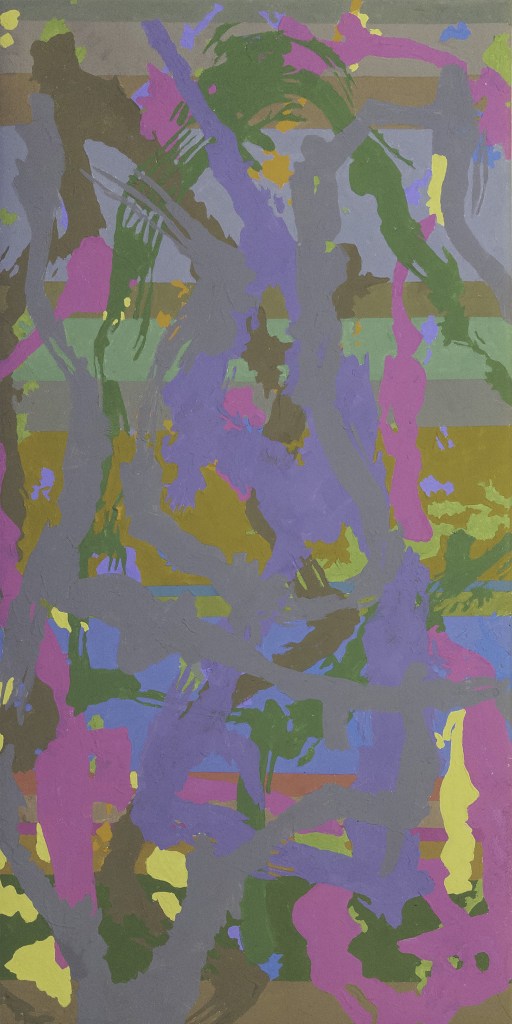
“Colors of the Year,” the current solo show of Longyear member Sheila McManus, consists of a series of abstract acrylic gouache paintings whose exquisite color harmonies of multiple squares arranged within a grid suggest careful premeditated planning. In fact, chance played a major role in the creation of each piece, from the artist’s use of motifs based on found sources to the choice of colors.
“Each one of the paintings has five or six colors, which I pick randomly from a group of color pencils,” Sheila explains. “I mix the paint to match the color of a pencil. Whatever the next color is, I try to match the value,” using the gray scale on her phone. An obvious influence on her use of the square format and close-in-value colors is Josef Albers, specifically his exploration of “what happens when colors have similar values but different hues or degrees of saturation—how colors advance and recede and sometimes seem to disappear into their neighbor colors,” as she notes in her artist’s statement. Other influences Sheila cites are Fairfield Porter, Lois Dodd, and Albert York.
Besides the values, which range from very light to very dark across the grid of small squares, Sheila employs other strategies. For example, in “Prague Castle 1,” consisting of four eight-by-eight-inch squares, she limited herself to two colors; in its sister piece, “Prague Castle II,” she used all 15 colors in her palette.
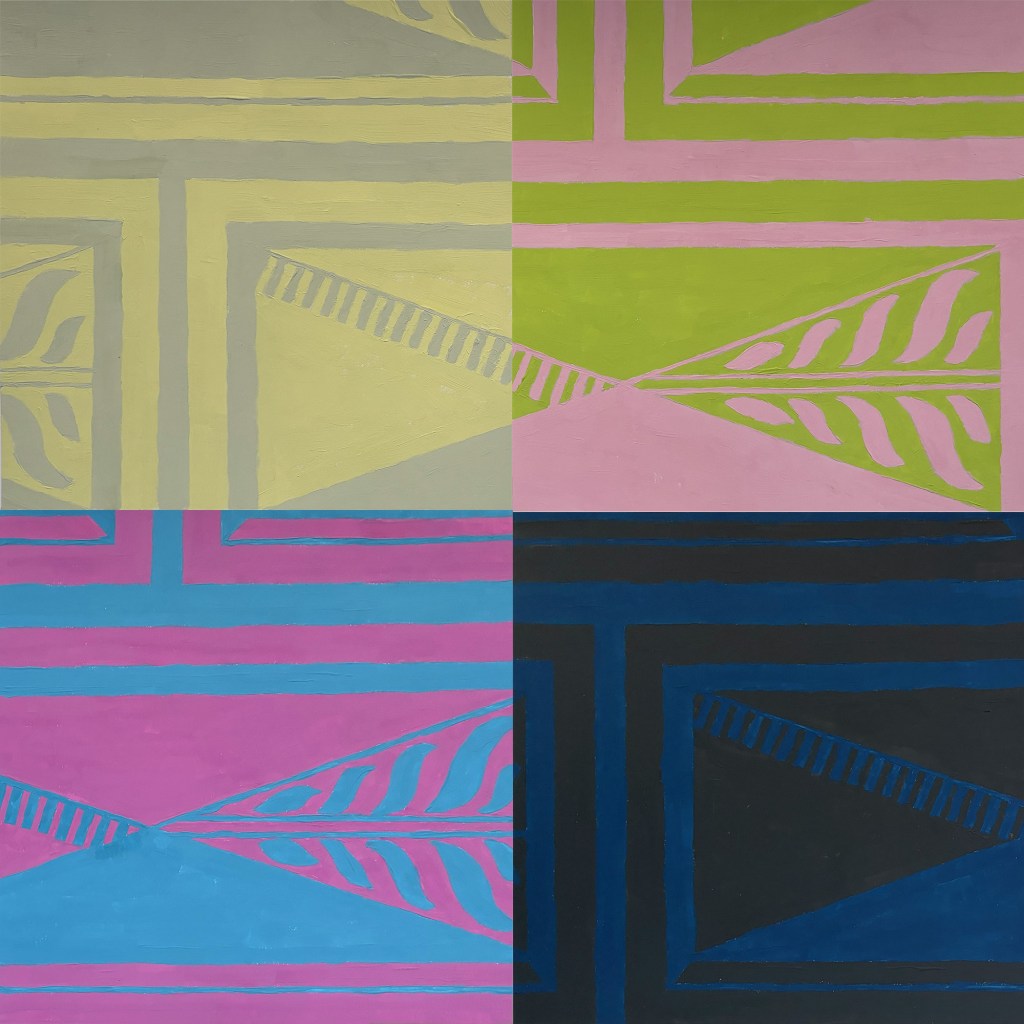
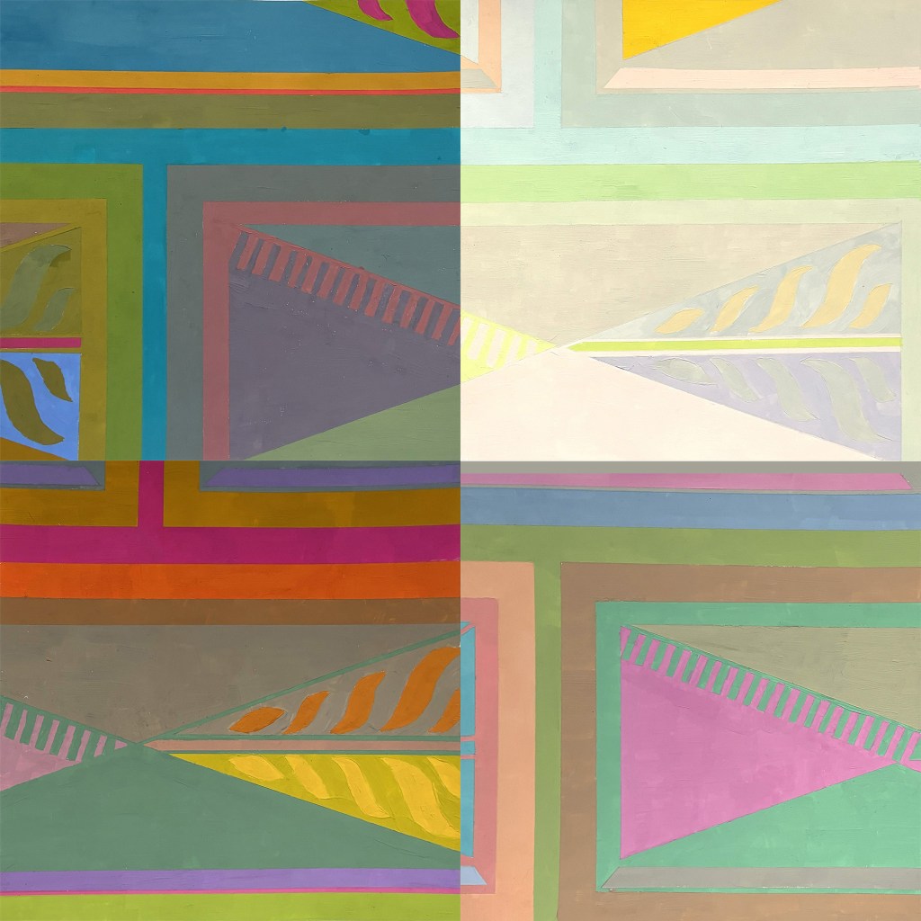
Such an approach has been incredibly freeing: “It’s all arbitrary,” she said. “I probably wouldn’t make these choices.” She also arranges the squares in the order in which she paints them, rather than agonizing over what goes best with what. “I’m interested in how they work together. It’s more interesting to have random compositions.”
Sheila was inspired to start the series after visiting the Thomas Cole House, in Catskill, in the summer of 2025 and marveling at the vivid colors of the restored wall decorations, textiles, and rugs. “The colors were surprisingly bright and bold and sometimes a little psychedelic and discordant,” she says. She took photographs and made oil paintings based on a section of one carpet’s design (one of which is hanging at the entrance to the show). She shifted to acrylic gouache, a medium she was introduced to in a workshop hosted by artist David Hornung, decided to choose colors from random from her color pencils, and combined 16 small paintings into her first grid in “Thomas Cole Rug 1.”
The shift in values across the different squares suggests a scintillation, a play of brightness and dark, subdued and saturated hues that highlights the inherent expressive power of color and is a delightful signature of the series.
“Prague Castle” is taken from a Renaissance diamond pattern painted on the wall of the castle Sheila visited on a trip to the city last fall. Other motifs were based on her photographs of the wallpaper in her dentist’s office (“I’ve been looking at this for decades—the shapes are fun to paint and a little like landscapes”); Helen Frankenthaler’s painting Commune, which she observed at MoMA last winter; the deteriorating tile floor in her New York City bathroom; the bathing suit of her husband, Mark, which she was ripping into rags; a notebook with a child’s drawings in marker she discovered in Tompkins Square Park; and the pattern design of skulls on a box of See’s Chocolates commemorating the Day of the Dead (entitled “Mildred’s Birthday,” the piece of rotating skulls relates to Sheila’s 100-year-old mother-in-law, who “is really into chocolate, is sick of being alive, went to Mexico on her honeymoon, and is a good painter”).
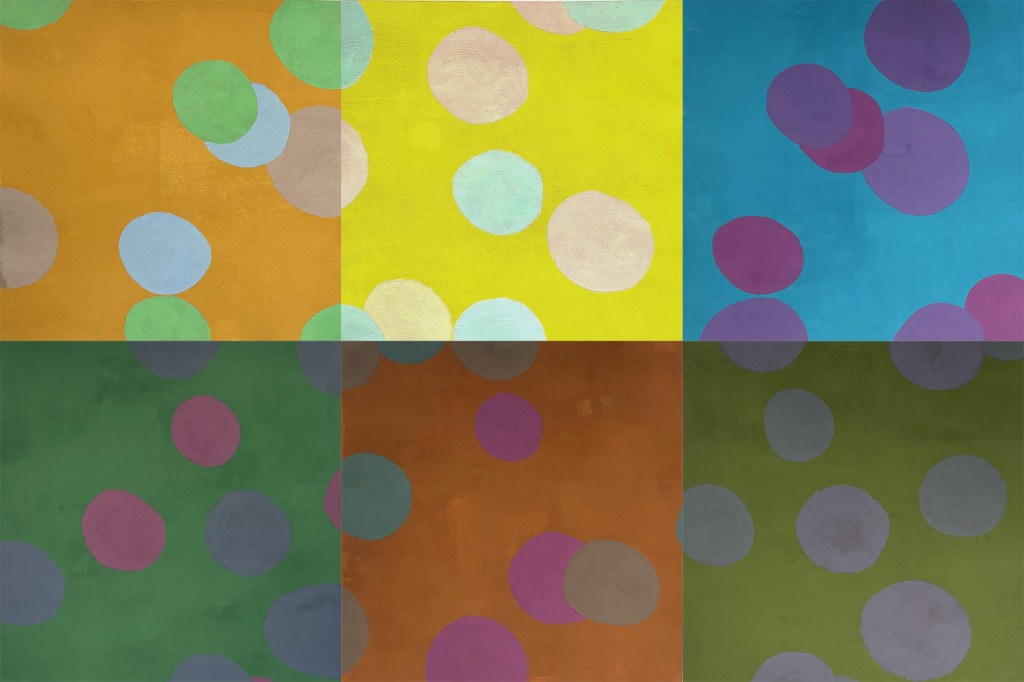
“Adelphi Dots” was copied from a replica wallpaper she glimpsed in a store window in Sharon Springs, while “Design School Plaid” was derived from the circa 1980s plaid pattern on display at an interior design show in Manhattan. “Ipanema,” whose curvilinear geometry and bright yellows and acid oranges suggests the aesthetics of the 1960s, was derived from a tile designed by California artist Jim Isermann.
Dividing her time between the East Village apartment and house in Halcottsville she shares with Mark, Sheila attributed the modular format of the works in part to her small painting space. “I’d love to get a residency and have access to a larger studio,” she said. However, that format has the advantage of being user friendly for potential buyers, who can pick up a single square for $150 or two for $250—though it would be nice to have all four squares, in the case of the Bathroom Floor, Helen F., Mark’s Bathing Suite, or Design School Plaid series.
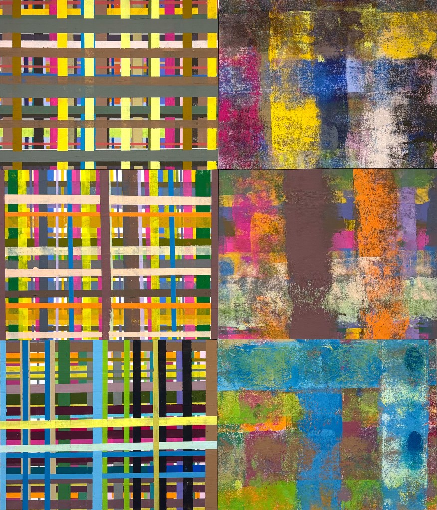
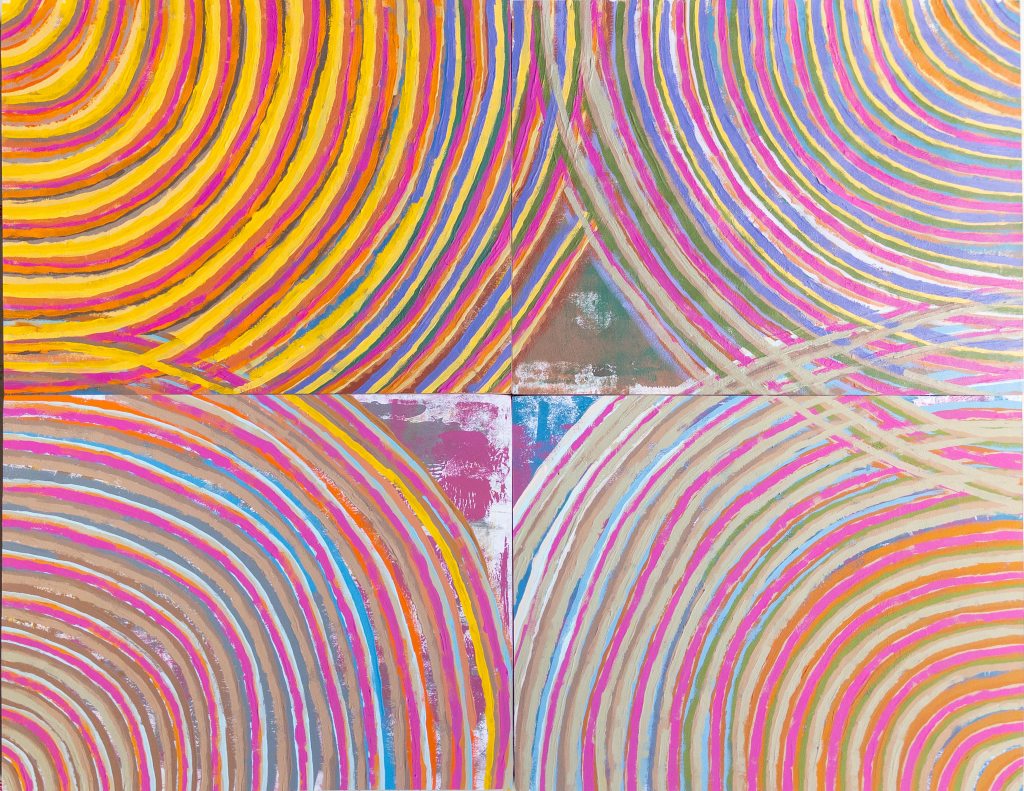
Rounding out the show are “Plaid and Blur,” in which the left half of the vertical piece consists of a plaid pattern made from taped lines and the right half a subtle, more atmospheric rendition of the motif using a ruler; the circular stripe painting, “March Stripes,” whose concentric lines were inspired by a show of Aborigine art she saw last year in Washington, D.C.; and two horizontal paintings consisting of overlapping, tape-width colorful lines, whose field-like composition and squiggly exuberance recalls Brice Marden. All of these pieces were made using the excess paint on her palette, though each avoids, somehow, being muddy (as my palette gets).
Sheila majored in painting at college and began her career coloring film strips for the Army. She became a graphic designer and then a web designer after the advent of the personal computer, retiring in 2018. Ever since, she has been painting and visiting galleries and museums fulltime. “Colors of the Year” runs through November 15.


Leave a Reply